Tuesday 30 January 2018

Mixing Mediums | Happy Birthday ft. Clearly Besotted "Sunshine & Smiles"


Hi everyone, thank you for stopping by. I hope you're having a great day.

By now, it should be no surprise that I love to colour. I have a bunch of different mediums over on my Product Review page and I would encourage you to try as many as possible. Having options means you can do whatever you're in the mood for; and that's a wonderful feeling.


To begin, I stamped this flower (I'm not sure what it is) from Clearly Besotted's "Sunshine & Smiles" set with Antique Linen Distress Ink on Strathmore 140lb cold press watercolour paper. I chose to use this Distress ink because I absolutely love the look of no-line watercolouring, and the Antique Linen is perfect for that.

I then used a mix of Distress inks and my Zig Clean Color Real Brush Markers to colour the image in. With both mediums I used a small #2 round watercolour paint brush with clean water to get the colours moving. You can certainly use a water brush, but I prefer the control I get with a regular paint brush.

Once the panel was completely dry, I stamped the greeting from CTMH "Cursive Birthday" set with Goldenrod Pigment ink by CTMH. Because of the texture of the paper and the finicky nature of pigment ink, I stamped this with the MISTI.

I then adhered a panel to a piece of coordinating cardstock that I had in my stash and mounted the whole lot to the front of a standard A2 sized card base.

To finish off the card, I adhered a scattering of yellow sequins across the panel. Typically, I would have used my glitter pens over the petals, but I didn't want the ink to reactivate with the moisture.

I hope you like today's card and are inspired to create something of your own. If you haven't already, please follow me on the right side bar or over on Facebook, so you don't miss any future posts. Drop me a line in the comments section below and let me know what you think.

Monday 29 January 2018

Happy Heart Day Series | It Means I Love You ft Lawn Fawn's "Rawr"


Hi everyone, thank you for stopping by. I hope you're having a great day.

The spring release from Lawn Fawn was amazing this year. By far my favourite set is the "Rawr" with this super cute little dinosaur; and what's even better is that it can be swapped out for use with  any season. "Rawr means I love you", "Rawr means Happy Birthday", "Rawr means Merry Christmas" the list just goes on and on. Good job Lawn Fawn!


To begin, I stamped the dinosaur, hearts and the speech bubble from Lawn Fawn's "Rawr" set with CTMH archival ink on 110lb white cardstock.

I then trimmed that down and coloured all the images in with Derwent Inktense pencils, using clean water to move the colour around. I'm still learning the ins and outs of these pencils so when I have had more time to use them, there will definitely be a review.

Once the panel was dry, I wrapped a length of bakers twine around the bottom and tied a bow. I popped the panel up on some foam tape and adhered it to a piece of patterned paper from Lawn Fawn, then mounted the entire piece to the front of a standard A2 sized card base.

I hope you like today's card and are inspired to create something of your own. If you haven't already, please follow me on the right side bar or over on Facebook, so you don't miss any future posts. Drop me a line in the comments section below and let me know what you think.

Friday 26 January 2018

Monster Hugs | ft Lawn Fawn "Monster Mash" and Zig Clean Color Real Brush Markers


Hi everyone, thank you for stopping by. I hope you're having a great day.

We've all needed a get well card for someone we care about. Whether they're just feeling down and we want to help cheer them up, or there's an illness and our only expression is the written word. It's always nice to know that someone, somewhere is thinking about us when we need that support the most.

I've done many get well cards, usually floral thinking of you type things that are pretty or simple cute designs to make someone smile; but what about those kids that are under the weather? With social media recording our every day lives, we see more and more these really sick kids that are missing out on family gatherings, birthday parties and school.

Today I have a get well card, specifically for those kids. They may be going through things that most adults could never dream of, but deep down, they're still kids - and finding the right expression, something they will understand is very important.


To begin, I stamped the monsters from Lawn Fawn's "Monster Mash" with CTMH archival ink on Strathmore 140lb cold press watercolour paper. I created my own greeting using part of the sentiment from the same set and the large letters from CTMH "Framework Alphabet".

To colour each area, I added a line of colour with the Zig Clean Color Real Brush Markers where I wanted the deepest colour and then used clean water to pull the colour out. If you haven't used these markers, I highly recommend you check out my review (linked above) and give them a try. These were definitely one of the best purchases I have ever made.

For the grass and the sky, I wet the paper with clean water then dropped in the colour from the pen, I wanted it to be rather vibrant, so this took a couple layers - there is a ton of pigment in these pens and they blend incredibly well.

Once the panel was completely dry, I used super sticky two-way tape to adhere it to the front of a standard A2 sized card base.

I hope you like today's card and are inspired to create something of your own. If you haven't already, please follow me on the right side bar or over on Facebook, so you don't miss any future posts. Drop me a line in the comments section below and let me know what you think.

Wednesday 24 January 2018

Happy Heart Day Series | Unbearable Without You ft. MFT "Up in the Air"


Hi everyone, thank you for stopping by. I hope you're having a great day.

I love sets that can be used for multiple seasons - a good set that can be used any time of year is probably one of the best investments a card maker can possibly make. Today's card uses just such a set from MFT.

If you are in the market for some new sets or are just setting out, I would recommend taking the time to find sets that can be used for multiple occasions. This will get you the best bang for your buck.


To begin, I stamped the bear from MFT's "Up in the Air" set four times with Memento Tuxedo Black ink on 110lb Copic-friendly cardstock.

I used Copic markers to make two look like pandas and the other two to look like little brown bears. I then fussy cut them out - without leaving a border and used my black marker to edge each of them.

I used two of my square dies to cut frames from some red paper - though it wasn't quite the red I envisioned so I used a Copic marker to darken them up a bit.

I filled each of the little shakers with red heart confetti from Recollections and adhered them to the front of my standard A2 sized card base. I then ran each of my bears through my mini Xyron sticker maker and placed them on the front of each window to make them look like they were peeking out.

Once they were all adhered, I realized I had not stamped my greeting. Normally I would have stamped the greeting before adhering my elements in place, but I just got so excited about the card coming together that I completely forgot.

I tried to peel up each of the windows, but that wasn't happening. Luckily I was able to put the card base in my MISTI and stamp the greeting a couple times to get a good impression and made a mental note to do the greeting first. If I didn't have the MISTI I'm not certain it would have turned out well.

So let that be a fun little lesson - always do your stamping before adding dimensional stuff to the card.

I hope you like today's card and are inspired to create something of your own. If you haven't already, please follow me on the right side bar or over on Facebook, so you don't miss any future posts. Drop me a line in the comments section below and let me know what you think.

Tuesday 23 January 2018

Welcome Home Mashup | ft. Lawn Fawn and Mama Elephant


Hi everyone, thank you for stopping by. I hope you're having a great day.

I may have mentioned this before, but I love mash-ups. So much of the time we limit ourselves to a single company per project and that's all well and good; but what's the point of buying very similar stamps from different companies just to keep the same brand throughout the project? It seems silly to me.

Today's mashup includes older sets from both Lawn Fawn and Mama Elephant - two of my absolute favourite companies!


To begin, I stamped the branch from Mama Elephant "Lunar Extras" with Memento Tuxedo Black ink on 110lb Copic-friendly cardstock. I then stamped the greeting as well as the remaining images from Lawn Fawn's "Home Sweet Home" with the same ink.

I coloured all the images in with Copic markers and used my Stardust glitter pen for the very centre of each blossom.

Once the colouring and shadows were in place, I wrapped a length of baker's twine around the top and tied a bow. I then popped the panel up on foam tape and adhered it to the front of a standard A2 sized card base.

I hope you like today's card and are inspired to create something of your own. If you haven't already, please follow me on the right side bar or over on Facebook, so you don't miss any future posts. Drop me a line in the comments section below and let me know what you think.

Monday 22 January 2018

Happy Heart Day Series | Hello Cupcake ft Clearly Besotted "Sweet Treats"


Hi everyone, thank you for stopping by. I hope you're having a great day.

Today's card is a quick and easy design that can be duplicated if the need arises. My 5 year old daughter actually came up with the basics for this design when she asked me to stamp some images for her to colour.

She likes to pick out the stamps and then tells me where to stamp them with all the seriousness of a structural architect; "no a little bit that way", "can you make the side ones come down so it looks like a rainbow", "Mommy, those aren't even" and so on. She's definitely my little artist and has a great eye for colour and layout. I think it will serve her well in the future.


To begin, I stamped the greeting and the three little hamsters from Clearly Besotted "Sweet Treats" with Memento Tuxedo Black ink on 110lb Copic-friendly cardstock, then coloured them with Copic markers.

I trimmed the top and bottom of the panel and adhered that to a piece of patterned paper by Lawn Fawn. I then mounted that to the front of my standard A2 sized card base.

To finish off the card I used some Nuvo Crystal Drops to create coordinating enamel dots and used Glossy Accents by Ranger on the sprinkles of the doughnut.

I hope you like today's card and are inspired to create something of your own. If you haven't already, please follow me on the right side bar or over on Facebook, so you don't miss any future posts. Drop me a line in the comments section below and let me know what you think.

This card is for:
Muse Challenge #250

Simon Says Stamp Wednesday Challenge
The Card Concept

Saturday 20 January 2018

Sympathy Silhouette | ft. Distress Inks


Hi everyone, thank you for stopping by. I hope you're having a great day.

We all have our favourite types of cards to make, I seem to go through phases - aside from whichever season or series I'm working on, I find I typically make a lot of birthday cards to fill in the spaces but every so often I find myself making a lot of sympathy cards - or "thinking of you" cards that can be used as sympathy cards.

I find them calming and comforting when I'm not feeling very awesome.


To begin, I used Chipped Sapphire, Faded Jeans, Dusty Concord and Seedless Preserves Distress Ink to create my background. I then splattered it with clean water and patted it dry with a clean paper towel.

Once the background was completely dry, I used the floral silhouette stamp from CTMH "Paper Garden" with archival ink. I prefer to use archival ink because it is waterproof and won't bleed if the background isn't actually completely dry.

I stamped the greeting with the same archival ink and then mounted that panel to the front of a standard A2 sized card base (this time in black). To finish off the card I added a few mini diamonds to brighten it up a touch and to add a bit of embellishment because I just can't stop myself.

I hope you like today's card and are inspired to create something of your own. If you haven't already, please follow me on the right side bar or over on Facebook, so you don't miss any future posts. Drop me a line in the comments section below and let me know what you think.

Thursday 18 January 2018

Happy Heart Day Series | The Sweetest ft Lawn Fawn "Sweet Friends"


Hi everyone, thank you for stopping by. I hope you're having a great day.

I mentioned before that I had considered scrapping this year's Heart Day series. But as I push through it - channeling the things that I want to feel instead of the things I do feel - I found more and more that though the design was harder for me this year, the process was just as calming. Moreover, I felt more accomplished when the card was completed because the initial steps were more difficult.

I do think that things are starting to turn around here, I don't have any illusions that this is going to be an easy road to travel. It's hard work and it takes a determination that is stronger than the "feelings of the moment". Falling in love is easy, that's why they call it falling; it takes no effort. Maintaining that love after the initial "high" wears off is a lot more work, and it shows in all the little things.

So if you've been floundering lately, or feel like it just isn't quite the same, think back to the beginning and figure out what it was that brought you both together to begin with. Then from that, what things you've let slide or have allowed to slide. Even recognizing those tiny little things can be helpful, make a choice to love and to show that love.


To begin, I stamped the greeting and the froyo image from Lawn Fawn's "Sweet Friends" with Memento Tuxedo Black ink on 110lb Copic-friendly cardstock. I coloured the image in with Irojiten Coloured Pencils by Tombow. If you haven't checked these pencils out yet, I highly recommend that you do.

I then tied a length of bakers twine around the two corners and then popped the panel up on foam tape. I adhered a piece of patterned paper to the front of my standard A2 sized card base and mounted the panel to the front of that.

To finish off the card I used two shades of Nuvo Crystal Drops to add some embellishment across the front of the card.

I hope you like today's card and are inspired to create something of your own. If you haven't already, please follow me on the right side bar or over on Facebook, so you don't miss any future posts. Drop me a line in the comments section below and let me know what you think.

Wednesday 17 January 2018

Floral Thoughts Series | In My Thoughts ft. Clearly Besotted "Thinking of You"


Hi everyone, thank you for stopping by. I hope you're having a great day.

"Thinking of you" cards are pretty versatile, depending on what you write on the inside, they can be used for almost any occasion. Sympathy, Birthday, Anniversary - it all depends on what you want to say. Sometimes people are just in your thoughts because they popped into your head for no reason at all, and it's always nice to know someone is thinking of you.

For this reason, I tend to leave the inside blank so I, or someone else can write a more personalized message.


To begin, I stamped the orchid image from Clearly Besotted "Thinking of You" stamp set with Memento Tuxedo Black ink on 110lb Copic-friendly cardstock. I coloured the image with Copic markers and then masked it off.

I used Spun Sugar Distress Ink with a damask stencil to add a light pattern to the background. Once that was completely dry, I removed the mask and used a light warm gray marker to create a shadow to the right of the flowers.

I stamped the greeting from the same set with Memento Ink and mounted the panel to a piece of coordinating pink cardstock. To add a bit of interest and to ground the image I added a length of dark pink bakers twine.

Finally I adhered the whole piece to the front of a standard A2 sized card base.

I hope you like today's card and are inspired to create something of your own. If you haven't already, please follow me on the right side bar or over on Facebook, so you don't miss any future posts. Drop me a line in the comments section below and let me know what you think.

Tuesday 16 January 2018

Happy Heart Day Series | Tropical Love ft Lawn Fawn "Gnome Sweet Gnome"


Hi everyone, thank you for stopping by. I hope you're having a great day.

Sometimes you start out trying to do one thing, or just playing around with no real plan and the result turns out better than you thought it would.

This card is also my first attempt at "mirror stamping" - a fun technique where you can flip an image so it faces the other way. It definitely takes practice, but the results can be very satisfying.


To begin, I stamped the right flamingo from Lawn Fawn's "Gnome Sweet Gnome" set with Memento Tuxedo Black ink on 110lb Copic-friendly cardstock. I then used the mirror stamping technique with Paper Smooches "Stamp Mirror Blocks" set to get the flamingo on the left.

The image will not come out as crisp as the original stamp and I highly recommend a stamping tool like the MISTI to get it lined up the way you want it; to fill in the areas that didn't stamp as clearly, I used a Copic-safe liner to trace the lines of the stamp.

I then masked them both off and started on the background. I created a circle mask for where I wanted my setting sun to be and then began sponging Tumbled Glass, Salty Ocean and Faded Jeans Distress ink to create the water.

For the sky, I started with Wild Honey at the bottom and worked a blend with Dried Marigold and Worn Lipstick Distress inks, going back and forth until I was happy with the gradient.

Once those were completely dry I removed the sun mask and sponged in Mustard Seed and Scattered Straw.

I then removed the masks from the flamingos and coloured them with Copic markers. I used my Black Soot Distress marker to create the island shadows in the background, and my Salty Ocean Distress marker to create texture in the water. For the white reflection of the water I used the Copic Opaque White.

Finally I mounted the panel to a slightly larger piece of black cardstock and then adhered the whole lot to the front of a standard A2 sized card base. I felt that this card really spoke for itself so I opted to not include a greeting.

I hope you like today's card and are inspired to create something of your own. If you haven't already, please follow me on the right side bar or over on Facebook, so you don't miss any future posts. Drop me a line in the comments section below and let me know what you think.

Monday 15 January 2018

Monochrome Monday Series | ft. Stampin' Up "Birthday Blooms"


Hi everyone, thank you for stopping by. I hope you're having a great day.

So maybe it isn't a true monochrome because of the green, but then does gray really count as a colour? I'm counting it. This one is pretty straightforward, so I'll fill in with a little bit of an update.

If you've been reading over the past couple weeks, you'll know that things have not been awesome. My impression as it stands is that things are getting better. But then I thought things were getting better before and boy was I wrong.

It's a slow and incredibly hard road right now and honestly I have no idea what will happen at the end of it. There are still moments where everything is raw and painful but they're more manageable, they don't hurt less and it's always hovering right at the back of my mind, every now and then they'll resurface and it's hard to breathe.

Card making and art has been a fantastic distraction so at least I'm not running out of things to blog. I would like to thank everyone who has been reading along and all the private well wishes you've sent. They mean the world to me.


To begin, I stamped the large blossom from Stampin' Up "Birthday Blooms" with Memento Tuxedo Black ink on 110lb Copic-friendly cardstock. I wanted to go incredibly pale with this one, so I stuck with the lightest of the cool grays and only a touch of green.

I adhered the panel to a slightly larger piece of grey cardstock and then mounted the whole lot to the front of a standard A2 sized card base.

To finish off the card I used some Glossy Accents by Ranger to the centre of the flower and some iridescent sequins across the panel.

I hope you like today's card and are inspired to create something of your own. If you haven't already, please follow me on the right side bar or over on Facebook, so you don't miss any future posts. Drop me a line in the comments section below and let me know what you think.

Sunday 14 January 2018

Product Review Series | Black Widow & Scorpion - Wax Based Coloured Pencils


Hi everyone, thank you for stopping by. I hope you're having a great day.

Today I'd like to talk about the Black Widow and Scorpion wax-based coloured pencils by MediHealth. I had been seeing these pencils more and more in different social media groups and I wanted to know what the hype was about.

So sit back, grab a drink and read on. As always, this is going to be full of pictures and information!
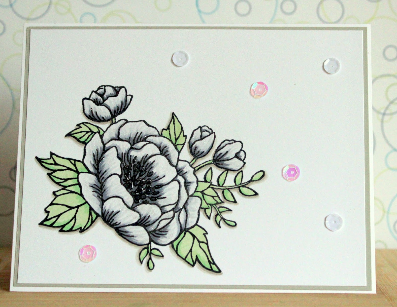
For the purposes of this review, the image stamped is from Lawn Fawn's "Our Friendship Grows" stamped with Memento Tuxedo Black ink on 110lb white cardstock and 65lb kraft cardstock.


These pencils have recently gained a lot of popularity and I wanted to know why. So when Amazon (Canada) had these on a super sale, I jumped for them. At first I was confused about these - were they the same, was one set bigger? As it turns out the Scorpions are a continuation of the Black Widows, so as of this writing there are 48 different pencils between the two sets with plans for a new set in the spring of 2018.

  • Wax-based
  • Hexagon barrel
  • Scorpions have a number and colour name right on the pencil, the Black Widows do not
  • Both boxes include a colour swatch - though I found this to be relatively inaccurate
  • Black wood
  • Pre-sharpened
  • Vibrant colour


As I mentioned, I tested these on 110lb white cardstock and 65lb kraft cardstock, I chose these papers as they are the most common papers I use in my crafting. For this image, I used two different shades of red.

I prefer to test with reds because reds are typically the hardest colour to use - no matter what the medium.

Some of my observations:

  • The core is very soft - much like a pastel. I would argue that the core is softer than those in the Prismacolor Premier. However, the core is sturdier than the Prismas. It was a very different to use these. 
  • The colour lays down incredibly smooth, and spreads nicely. Much like using pastels. I didn't feel a need to resharpen the pencils before I used them; which was also interesting as I am insanely picky about the sharpness of my pencils.
  • The barrel is very smooth and the hexagon shape makes it feel smaller than a standard pencil in my hand. If you have read my other reviews, you'll know that I have some arthritic issues in my hand and I did find that using these for an extended period of time hurt me. So that is definitely something to keep in mind.

For the blendability test I chose one of each of the primary colours. The top was blended just using the pencils, and the bottom was blended with Gamsol.

Observations:
  • I found that the pencils layer nicely, but didn't really "blend" together to create a new colour the way I expected them to. I found the colours just seem to lay around each other.
  • When blending with the Gamsol the pigment melted very nicely and sank between the teeth of the paper and helped with blending the two different colours. You can see this in the orange and green areas under the line.

For the erasability test, I used the SC33 Blood Red with increasing layers and pressure as I progressed down the page. On the left I used a regular white eraser and on the right I used the Tombow Mono Sand eraser.

Observations:
  • Both erasers did a relatively decent job of removing the lighter shading at the top. 
  • The regular eraser would most likely remove a small, light mistake - we've all been there.
  • The Tombow sand eraser was able to remove a lot more pigment, but it took a bit of work. Depending on the quality of your paper this could be fine or detrimental to your project.

Here I have all the colours swatched (post on swatching coming soon), as you can see for the first 24 colours they have no names because none were provided. I worked out the colour order as I prefer it on a separate paper and numbered them myself. I like to show varying pressure moving from left to right.

The Scorpions do have their names and numbers on the pencils - I emailed the company about this and was told that when they rerelease the Black Widows in 2018 they will have names and colour numbers, but were unwilling to provide me with that list at this time.

I used a thin piece of painters tape and just wrote the number on the end so that I could reference back to my swatch and determine the colour I want to use.

They do have a couple unusual names for some of the colours, Blood Red, Bug Brown and Pig's Ear, but this is not really consistent. They have some regular names but I think it would be fun if they took this further for the whole collection.


I wanted to include this close up picture from a card that I had completed a little while ago. I used the Black Widows and Scorpions for the Balloons in this Happy Hippos card.  I had wanted to use them for the entire card, however there is a very sad lack of greys.

Overall Conclusions:
  • These pencils have an incredible value vs cost. They were very inexpensive and would be an excellent addition to any colourist's collection at any level. I'll definitely be getting the next set that comes out for the collection.
  • I will be getting a pencil case for these because I hate the cardboard box the Black Widows came in and I like to keep all my pencils together.
  • The pigment lays down beautifully, requiring very little pressure though blending takes some work.
  • They sharpen very well, I use the T'GAAL multi-sharpener by Kutsuwa and I highly recommend it for every pencil that I have and it has not failed me yet.
If you are looking to try something new or get a "better" type of pencil at a great price for yourself or as a gift, I highly recommend these. At this point there is a terrible lack of grays and I am hoping that when the next volume comes out they will have a few more.


I hope you enjoyed today's review. If you have any questions about this product or a suggestion for a future review, drop me a line the comments section below and let me know. If you haven't already, please follow me on the right side bar or over on Facebook, so you don't miss any future reviews.

*disclaimer: I am not sent products for review nor am I paid to review them. I review the products that I personally use, that I find interesting and that I have paid for. I receive no reward, incentive or payment to create a review. All reviews are based on my experience and are my opinions only.

Saturday 13 January 2018

Sincere Thanks and a Little Lesson About Glitter Pens


Hi everyone, thank you for stopping by. I hope you're having a great day.

I had considered not posting this. I didn't really look at the picture before I gave the card away, so I didn't have the option of taking a second one. I suppose I could have redone the card, but then I thought I'd keep the post and share a little something I learned about glitter pens.


To begin, I stamped the rose image and the greeting from Clearly Besotted "Merci Beaucoup" with Memento Tuxedo Black ink on 110lb Copic-friendly cardstock. I coloured the image with Copic markers.

To add some interest, I rounded the corners at the bottom of both the panel and the 4 bar card base. Finally I added a few mini diamonds from CTMH.

Here's where I went wrong. I wanted the flower to sparkle. And not just a little bit. So I went over it when my clear Wink of Stella glitter brush pen. But because I'm me, and I can't stop myself - I waited until it was dry, then went over it again. Then again. And very possibly a fourth time; who's counting?

Looking at the picture, you're all probably thinking "uh not your best colouring, Trina" - but no, that's just glitter. Lots and lots of glitter. So a couple things I learned from this: first, check the picture before giving away the card and second, maybe four or five layers of glitter is just a bit too much.

So it sparkled. Like a whole lot and in real life it doesn't look this incredibly weird. Let's be honest as pictures go - this one makes up for every other one that I have ever posted where I said "the camera just doesn't pick up the shine".

I hope you like today's card and are inspired to create something of your own. If you haven't already, please follow me on the right side bar or over on Facebook, so you don't miss any future posts. Drop me a line in the comments section below and let me know what you think.

Friday 12 January 2018

Hello Baby Girl | ft. Clearly Besotted "Wild Thing"


Hi everyone, thank you for stopping by. I hope you're having a great day.

I was going through old files just cleaning out old stuff that will never make it here, and came across this one. I had made an entire set of these a couple years back and somehow it never ended up being posted. So today I'm going to share this super sweet baby card - also the closest I have have ever come to "mixed media".


To begin, I stamped the giraffe from Clearly Besotted's "Wild Thing" with Memento Tuxedo Black ink on 110lb Copic-friendly cardstock and coloured her in with Copic markers. I fussy cut her out and popped her up on some foam tape and set her aside.

To create the background, I mixed some Victorian Velvet Distress ink with some homemade embossing paste (DIY post coming soon), using a palette knife to work the paste through a dotted stencil on the left side of my panel.

Once that was completely dry, I adhered the scripty hello from Lawn Fawn and stamped the "baby" from Lawn Fawn's "Critters Down Under" set with Memento Ink.

I had some leafy die cuts from another project and arranged them over the dry embossing paste. Finally I mounted my giraffe over top.

I hope you like today's card and are inspired to create something of your own. If you haven't already, please follow me on the right side bar or over on Facebook, so you don't miss any future posts. Drop me a line in the comments section below and let me know what you think.

Thursday 11 January 2018

Floral Thoughts Series | Wildflower Wishes ft. Stampin' Up "Flowering Fields"


Hi everyone, thank you for stopping by. I hope you're having a great day.

We say that change is a wonderful thing and maybe it is... later on. It's terrifying and it's saddening and it's stressful. There's a reason it's called a comfort zone. Anything outside that can be so overwhelming we're left paralyzed, we're stuck in one spot as our minds try to catch up with what's happening around us.

Change can be the most terrifying thing, especially when we don't expect it. When we're walking along our carefully planned out lives, then suddenly a tree blocks our way.  We didn't ask for the tree, we didn't ask for a shake up to our routine. Now we have to forge a new path, take a new road fraught with unfamiliarity.

But what if, while we find a way around this obstacle, we find a beautiful new place that we never even knew existed? So while change can be frightening and stressful, there is also a chance that we can find something we never expected to see.


To begin, I stamped the flower images from Stampin' Up "Flowering Fields" with Memento Tuxedo Black ink on 110lb Copic-friendly cardstock. I then masked all the images and sponged Peacock Feathers, Tumbled Glass, Spun Sugar and Milled Lavender Distress inks to create the background.

I removed the masked and coloured all the images with Copic markers and stamped the greeting with Memento ink.

I adhered the panel to the front of a standard A2 sized card base. To finish off the card I added clear Wink of Stella over the petals and the butterfly to give it some shimmer. Sadly, the camera just doesn't pick it up as well as I would like.

I hope you like today's card and are inspired to create something of your own. If you haven't already, please follow me on the right side bar or over on Facebook, so you don't miss any future posts. Drop me a line in the comments section below and let me know what you think.

Wednesday 10 January 2018

Happy Heart Day Series | Be Mime ft. MFT "Be Mime"


Hi everyone, thank you for stopping by. I hope you're having a great day.

I'm not going to lie, I seriously considered skipping the Valentine's Day series this year. It has been a time of heartbreak for me, and while I pull a lot of my inspiration for emotions - more specifically sadness (stereotypical artist, right?) the idea of creating an entire series dedicated to love was so overwhelming for me that I thought it may have been better to just skip it.

I sat and looked at my lovey stamps and my pretty heart paper and just cried. How could I channel anything meaningful into cards when I felt so terrible? But the more I thought about it and stewed over it the more I realized that I could channel what I want to feel instead of what I was feeling.

I'm not generally one for patterned paper, I have a very difficult time working with it, it's one of the things I am challenging myself to work with more this year. I chose this incredibly busy background to represent the noise of the season, all the shops and people and love in the air; to be in opposition to the silent girl in the middle.

Maybe that's really deep, but you really just can't help how you feel.


To begin, I stamped the mime from MFT's "Be Mime" stamp set using Memento Tuxedo Black ink on 110lb Copic-friendly cardstock and coloured her in with Copic Markers. I wanted to keep her in very stark contrast to the background so I stuck with the cool and neutral grey families.

I used one of my stitched rectangles from Lawn Fawn to cut her out, then used some red bakers twine to create a border around the frame. I popped that up on foam tape and set it aside.

I adhered my patterned paper to the front of a standard A2 sized card base, then mounted my focus panel to the front of that.

I hope you like today's card and are inspired to create something of your own. If you haven't already, please follow me on the right side bar or over on Facebook, so you don't miss any future posts. Drop me a line in the comments section below and let me know what you think.

This card is for:

Simon Says Stamp Wednesday Challenge:
Use Patterned Paper

Cute Card Thursday:
Anything Goes

Tuesday 9 January 2018

You Do You | Single Layer ft. Distress Oxide Inks


Hi everyone, thank you for stopping by. I hope you're having a great day.

Getting to know myself has been one of the hardest things I have ever started to do. I say started because I spent a very long time putting my needs and dreams and wants last. Sounds funny? Maybe you're one of the lucky ones. My time as a stay at home mom over the last five and a half years had me making everyone but myself a priority. It's kids and husband and house first.

Part of me is super excited to try and focus on me and see what it is that I want to do. I want to do something that makes me happy and I want to do something where I feel accomplished. You know what I'm saying.


To begin, I masked off the front of a standard A2 sized card base and used Abandoned Coral and Wild Honey Distress Oxide ink to create the background.

Once that was dry, I put the card base in the MISTI and stamped the image and greeting using CTMH Archival black ink. I love to use archival ink (and CTMH is my favourite) over the Distress inks because it is waterproof - so in the event that the coloured ink isn't completely dry the black won't run.

I hope you like today's card and are inspired to create something of your own. If you haven't already, please follow me on the right side bar or over on Facebook, so you don't miss any future posts. Drop me a line in the comments section below and let me know what you think.

Monday 8 January 2018

Pet Sympathy | ft. Clearly Besotted "Thinking of You"


Hi everyone, thank you for stopping by. I hope you're having a great day.

A little while ago, a friend of mine lost her dog and like any other loss it was not awesome. Loss is a terrible thing, whether a pet or a loved one passes away, or someone incredibly important in your life decides that they need to get a new perspective. Grief is still grief, and it is cutting and it is hard and there are no words than anyone can ever say that will make it better.

All another person can do is sit and listen when you cry and rant and vent and throw things. But that's the most important thing; having a safe space where you can feel all those things without fear of judgement or reprimand. Just letting the other person know that you are there can make all the difference in the world.


To begin, I stamped the lilies from Clearly Besotted's "Thinking of You" set with Memento Tuxedo Black ink on 110lb Copic-friendly cardstock. I then coloured the image with Copic markers and masked it off.

I used Hickory Smoke and Black Soot Distress ink to create a dark halo around the flowers fading out towards the edges.

While that was drying, I prepped a piece of vellum with my powder tool and heat embossed these dog prints with detail black embossing powder, then fussy cut them out. I ran them through my sticker maker and adhered them to the panel.

I mounted the panel to a piece of charcoal cardstock then adhered the whole piece to a standard A2 sized card base. To finish it off I went over the petals with my clear Wink of Stella glitter brush pen.

I hope you like today's card and are inspired to create something of your own. If you haven't already, please follow me on the right side bar or over on Facebook, so you don't miss any future posts. Drop me a line in the comments section below and let me know what you think.

This card is for:

Inspired by Anita Bowden

Saturday 6 January 2018

Not for Sympathy Anymore | ft. Distress Inks and Inkadinkado Stamps


Hi everyone, thank you for stopping by. I hope you're having a great day.

As you know the last week has been pretty crappy. When I feel crappy I tend to make sympathy cards. Maybe I'm feeling sorry for myself and I need a little perk up, or maybe just channeling my grief into a project helps me to feel better.

So when I started this card, feeling crappy, my intention was to make a sympathy card. Obviously, I wasn't going to send it to myself, but the thought had crossed my mind. But by the time I was done the card, I didn't need it to be a sympathy card anymore. It was just a beautiful card that came together in as I worked on it.

I opted to not put a greeting on it, because maybe I'll use it as a "birthday card" or a "thinking of you card" or a "sorry your dog peed in your shoe" card. Who knows? I just know that at the end of the process the card didn't say "sympathy" to me - and I was okay with that.


To begin, I cut down a piece of Strathmore 140lb cold press watercolour paper. I prepped it with water to make the whole panel damp - but not wet enough to curl. Then I dropped in Peacock Feathers and Seedless Preserves Distress ink to create the background.

Once that was completely dry, I prepped it with my powder tool and stamped the images from Inkadinkado "Meadow" stamp set with VersaMark ink and heat embossed it with detail white embossing powder.

I then cut a piece of coordinating purple cardstock to create a border on the left and right of the watercolour panel, adhering it down with super sticky two-way tape. Next I mounted that on a white panel and rounded the corners on the right side.

I adhered that panel to the front of a standard A2 sized card base and rounded the right corners of the base as well. Finally I added a few sequins just to give some additional dimension and because I really just can't help myself.

I hope you like today's card and are inspired to create something of your own. If you haven't already, please follow me on the right side bar or over on Facebook, so you don't miss any future posts. Drop me a line in the comments section below and let me know what you think.

Friday 5 January 2018

Shadow Butterflies | ft. Forever In Time "Butterfly Fancy"


Hi everyone, thank you for stopping by. I hope you're having a great day.

A little while ago, I posted a card using a new (to me) stamp company and I really liked the results. Recently, I've been able to get my hands on some other sets and while the stamps themselves definitely need some "prepping" to be ink-ready, I'm enjoying the new designs.


To begin, I cut down a piece of Strathmore Bristol Smooth cardstock and used Salty Ocean and Broken China Distress Oxide inks to create the background. Once that was relatively dry, I used the Distress sprayer to spritz clean water and give the distressed look we all love.

I hit that with my heat tool - because I learned from the last piece that sometimes they take forever to dry. I then used a bunch of the butterflies from Forever In Time's "Butterfly Fancy" and Daisy White pigment ink from CTMH to stamp them randomly over the panel. I used first and second generation stamping to create a swarm.

While the lighting was pretty good, the camera didn't seem to want to really pick up the different layers of depth that was on the card. So in real life these butterflies are more bold than you can see here.

Once the white was dry, I stamped the greeting from CTMH "Cursive Birthday" using Pacifica pigment ink. I generally have pretty good luck stamping larger solid images with pigment ink, but less luck stamping the greetings - perhaps because the lines are finer - I seem to get these "trenches" in the ink. So I did this part of the stamping using my MISTI.

I mounted the piece to a coordinating piece of blue cardstock then adhered the whole piece to the front of a standard A2 sized card base.

I hope you like today's card and are inspired to create something of your own. If you haven't already, please follow me on the right side bar or over on Facebook, so you don't miss any future posts. Drop me a line in the comments section below and let me know what you think.

Thursday 4 January 2018

Golden Birthday | ft. Clearly Besotted "Friends Forever"


Hi everyone, thank you for stopping by. I hope you're having a great day.

Today I wanted to share a card that I was asked to create as part of a box set. She wanted two masculine and two feminine birthday cards - but "nice". Personally, I think all my cards are nice, that's why I continue to make them. But I know that isn't what she meant. She simply meant she didn't want the cutesy stuff that I love doing.

Something more elegant was required. Luckily, I love doing those as well.


To begin, I stamped the tulip image from Clearly Besotted's "Friends Forever" stamp set with Memento Tuxedo Black ink on 110lb Copic-friendly cardstock. I then masked off the image and sponged around the outside of the panel with Dried Marigold Distress Ink.

Once that was dry, I removed the mask and coloured the flower with Copic markers. I prepped the lower half of the panel with my powder tool and stamped the greeting from CTMH "Cursive Birthday" with VersaMark ink and heat embossed it with gold embossing powder.

I adhered the panel to a piece of shimmering yellow cardstock then mounted the whole lot to the front of a standard A2 sized card base.

To finish off the card I adhered a scatting of Sparkling Clear Sequins by Pretty Pink Posh across the front.

I hope you like today's card and are inspired to create something of your own. If you haven't already, please follow me on the right side bar or over on Facebook, so you don't miss any future posts. Drop me a line in the comments section below and let me know what you think.

Wednesday 3 January 2018

Sweet Birthday | ft. Clearly Besotted's "Sweet Treats"


Hi everyone, thank you for stopping by. I hope you're having a great day.

It's funny where people draw their inspiration. Not like looking at a card and seeing the things that you would change and then doing it but, where the emotional artsy side comes from. My friend draws her inspiration through doing things for other people. In the 12 years we have been paper crafting together, I don't think she has done more than a couple projects for herself. It's always cards and tags for teachers or baby albums for friends or gifts.

I'm not that like that. While I do give away or sell the vast majority of my work, my inspirations are very emotional. The strongest of which seems to be sadness. Apparently the more sad I am the better my creativity. Maybe it's the process and the focus that it requires.

Anyway, that being said I have gotten more cards designed and finished in the last few days than I have in the past couple weeks. Does that count as a win?


To begin, I cut down a piece of 110lb Copic-friendly cardstock and stamped the greeting these three adorable hamsters from Clearly Besotted's "Sweet Treats" with Memento Tuxedo Black ink.

I coloured all the images with Copic markers then added Glossy Accents by Ranger to the sprinkles on the doughnut and the cherries.

Once the panel was completely dry, I adhered it to a piece of striped pattern paper from My Mind's Eye and then mounted the whole panel to the front of a standard A2 sized card base.

I hope you like today's card and are inspired to create something of your own. If you haven't already, please follow me on the right side bar or over on Facebook, so you don't miss any future posts. Drop me a line in the comments section below and let me know what you think.

Tuesday 2 January 2018

Looking for Comfort | ft. Newton's Nook "Newton's Sick Day"


Hi everyone, thank you for stopping by. I hope you're having a great day.

I mentioned yesterday that things have not been spectacular around here. There are waves of "maybe it was all a dream" but then it all comes crashing back and it wasn't a dream. It happened and then comes a wave of crushing sadness. You lose time, and wonder why your coffee is cold even though you just poured it.

Sadness is a kind of sick, so today I made myself a get well card. Maybe you don't want to hear my random thoughts that just need to get out, maybe you do. I honestly don't know. I do know, however, that if I don't get them out somewhere, there's a good chance I'll explode and then my super clean craft room will be a big mess again.


To begin, I cut two banner pieces from 110lb Copic-friendly cardstock. I then cut a circle out of the one that will be the top. I lined the two pieces up and lightly traced a circle with my pencil on to the bottom piece.

The circle will be the guide for where I stamp this kitty image from Newton's Nook "Newton's Sick Day", I then erased the pencil line and coloured the image with Copic markers.

For the background panel, I used my largest stitched rectangle frame and cut a piece of the same cardstock. I used the little hearts from the same set and stamped them in CTMH Whisper ink randomly to create my own subtle patterned paper.

I used the same stamp with CTMH Cranberry ink to create a bolder pattern on the front banner. I adhered the banners together with some foam tape and then used a turquoise ribbon (as close of a match as I could find to the soup bowl) and tied it through the holes at the top.

Finally I mounted the banner to my background panel and adhered the whole thing to the front of a standard A2 sized card base.

I hope you like today's card and are inspired to create something of your own. If you haven't already, please follow me on the right side bar or over on Facebook, so you don't miss any future posts. Drop me a line in the comments section below and let me know what you think.

This card is for:

2 Crafty Critter Crazies
Challenge #10


Monday 1 January 2018

Monochrome Monday Series | Green Birthday ft. Distress Oxide Inks


Hi everyone, thank you for stopping by. I hope you're having a great day.

Happy New Year to all of you! With the new year, I have a few new series' coming and since the year starts on a Monday and we're all fans of alliteration, I thought to start out with Monochrome Mondays.

In this series, I'll be showcasing monochrome cards - this is really an effort to keep myself challenged and thinking outside of my comfort zone.

The last week has turned my whole world upside down and let me tell you it has not been awesome. Everything I thought I knew and held so close to my heart has been taken away and while it has been super fantastic for my creativity the rest of me feels lost and alone.


To begin I cut down a piece of Strathmore Bristol Smooth cardstock and used Peeled Paint and Lucky Clover Distress Oxide inks to create the background. I didn't really think that these two would blend the way I saw in my head, so I was pleasantly surprised when it turned out pretty darn close.

Once that was mostly dry - I really should have waited longer but I'm not exactly a patient person I used the circles from Lawn Fawn's "Let's Bokeh" stamp set with Daisy White ink from CTMH to create the Bokeh effect. I was a couple spots in when I realized that the Distress Oxide wasn't completely dry. So the spots are lighter than I wanted them to be and they picked up the green. In order to avoid contaminating my white, I wiped it clean with a baby wipe between applications.

I hit the panel with my heat tool to get all the pigment inks to dry, I really wish there were a more efficient way to get pigments to dry. They aren't even consistent. I've had pieces dry within half an hour and others that I had to leave overnight. It can be very frustrating.

Once the panel was pretty dry, I stamped the leaves from an old Inkadinkado set using Olive ink from CTMH in the lower right corner.

For the greeting I stamped a "Happy Birthday" from CTMH's "Cursive Birthday" with Olive pigment ink.

Finally, I mounted the Bristol panel to a darker green cardstock then adhered the whole piece to the front of a standard A2 sized card base.

I hope you like today's card and are inspired to create something of your own. If you haven't already, please follow me on the right side bar or over on Facebook, so you don't miss any future posts. Drop me a line in the comments section below and let me know what you think.